
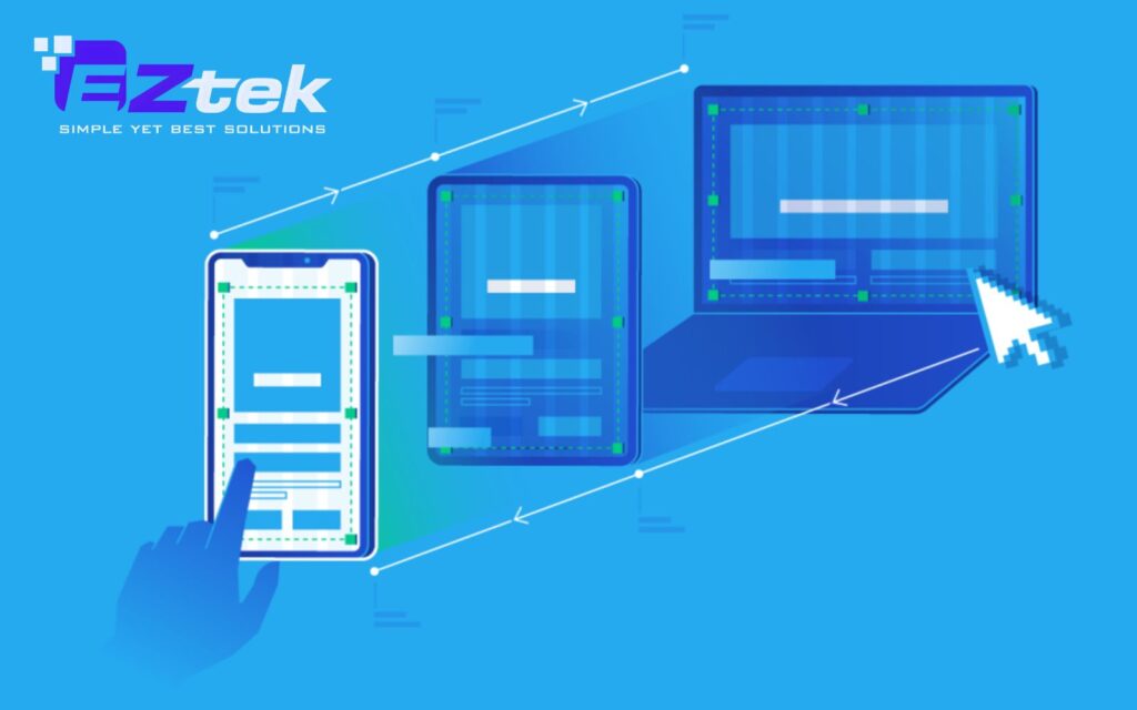
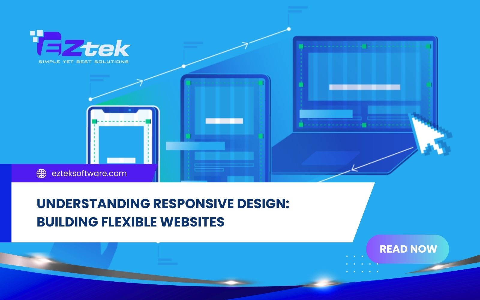
With mobile traffic surpassing desktop usage, many businesses now ask what is responsive design and why is it important for long-term success. Simply put, what is responsive design for websites is an approach that allows layouts, content, and interactions to adjust smoothly across devices. This guide of EZtek company will break down what is responsive design principles, practical components, and best practices that shape high-performing responsive websites.
What is responsive design?
Simply put, it is an approach to web development where a site’s interface automatically adjusts to the device’s screen size. By using HTML Responsive Web Design techniques, the layout “responds” to the user’s environment, facilitating easier navigation and information seekiđịng.
This flexibility is made possible through what is responsive design in CSS, utilizing media queries and relative units (%) to ensure content consistency. Instead of building separate sites for mobile and desktop, you create one fluid version that fits everywhere.
Key advantages of a responsive approach:
- Reach a Larger Audience: With more people browsing on smartphones, a mobile-optimized UI/UX is essential.
- Save Time and Effort: Developers only need to focus on one version of the design, reducing maintenance.
- Improve SEO: Search engines reward mobile-friendly websites with higher search rankings.
- Brand Consistency: Maintain a uniform look and feel across all devices without modifying your core guidelines.
The importance of responsive design
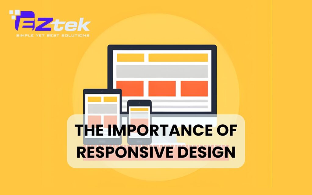
In an era where users seamlessly jump between laptops, tablets, and smartphones, having a static website is a significant liability. Understanding what is responsive design and why is it important helps businesses realize that flexibility is the key to retaining modern consumers. A responsive approach offers several critical advantages:
- Superior User Experience: By applying responsive design, you ensure that navigation is intuitive and content is readable without the need for manual zooming.
- Search Engine Visibility: Google explicitly favors mobile-friendly layouts. A single, responsive URL is easier for search bots to index, which directly boosts your SEO performance.
- Increased Conversions: When a site functions perfectly on a mobile device, users are more likely to stay longer and complete a purchase or contact form.
- Future-Ready Architecture: As new devices with unique screen sizes enter the market, a responsive site is already equipped to adapt, protecting your investment in the long run.
- Consistent Branding: It guarantees that your visual identity remains polished and professional, regardless of the hardware the visitor is using.
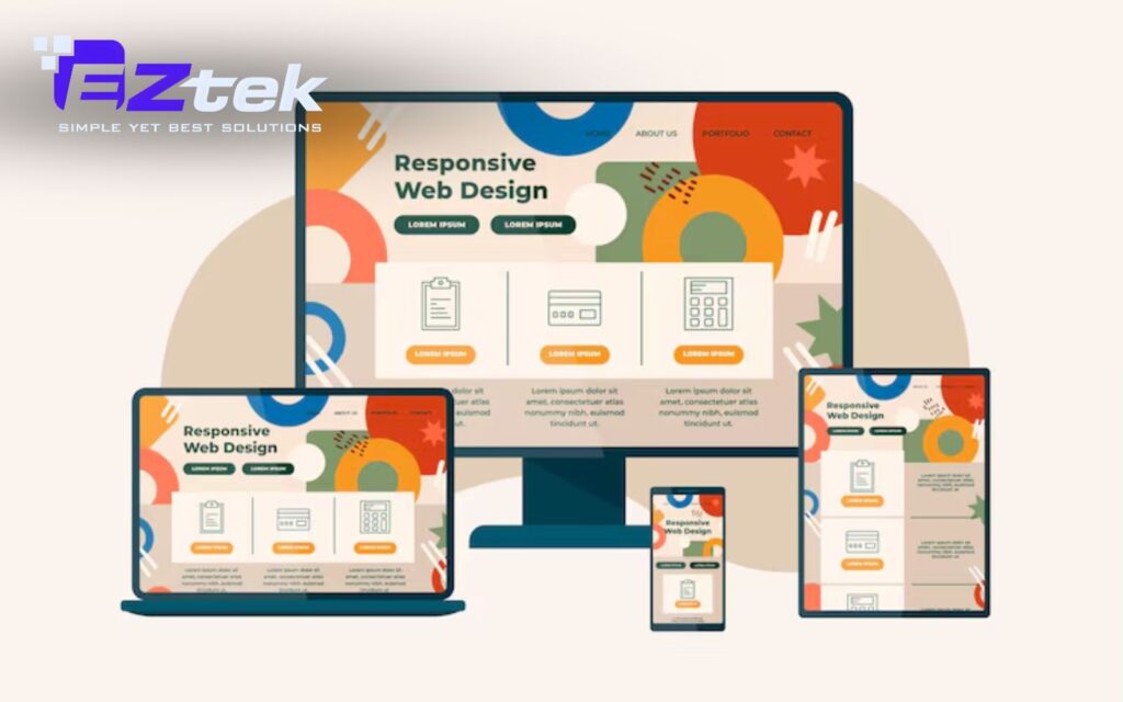
Components of responsive web design
Flexible layouts
Flexible layouts form the structural foundation of what is responsive design website development. Instead of fixed-width layouts, designers use fluid grids based on relative units such as percentages. This allows content containers to resize proportionally according to screen width.

Example:
A three-column desktop layout can automatically rearrange into two columns on tablets and a single column on mobile devices. This approach reflects essential what is responsive design principles, ensuring layouts remain usable on all screens.
Responsive Navigation
Navigation is a critical element of what is responsive design in UI UX. On smaller screens, traditional menus can become cluttered or unusable. Responsive navigation patterns, such as hamburger menus, collapsible navigation bars, or off-canvas menus help maintain clarity and ease of use.
Example:
A full horizontal menu on desktop transforms into a compact icon-based menu on mobile, improving accessibility without sacrificing functionality.
Media Queries

Media queries are the engine behind what is responsive design in CSS. They act as filters that detect the device’s characteristics, such as width, height, or orientation, and apply specific styling rules only when those conditions are met. This allows developers to create “breakpoints” where the design changes to better suit the screen size.
Example:
Using the code @media (max-width: 768px), a developer can tell the website to switch from a three-column layout to a single-column layout for better readability on smartphones.
Responsive videos and Images
In HTML Responsive Web Design, media files must be flexible to prevent them from breaking the layout. By using CSS properties like max-width: 100%, images and videos will never grow larger than their container but will shrink as the screen gets smaller. This ensures that visual content remains fully visible without horizontal scrolling.
Example:
An infographic on a blog post will automatically scale down its dimensions to fit the narrow width of an iPhone screen while maintaining its original aspect ratio.
Responsive text
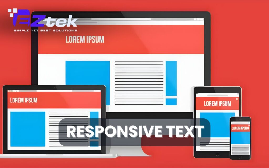
Legibility is a core part of the user experience, and text should scale appropriately across devices. Instead of fixed point sizes, responsive typography uses units like “em” or “rem,” which are relative to the base font size or the viewport size. This ensures that headlines and body text remain readable without the user having to pinch-to-zoom.
Example:
A large hero title might be set to 5vw (5% of the viewport width), so it appears bold on a desktop but shrinks gracefully to fit a smaller mobile screen.
Responsive web design frameworks
Selecting the right tools is essential for modern development. Frameworks provide the necessary scaffolding to build consistent, high-performance interfaces, allowing developers to implement a fluid grid system without writing every line of CSS from scratch.
The following table compares popular frameworks based on their strengths and ideal use cases:
| Framework | Primary Use Case | Core Strengths |
| Bootstrap | Rapid development and standardized layouts. | Features a robust 12-column grid and a vast library of pre-built UI components for fast prototyping. |
| Tailwind CSS | Highly bespoke designs with unique branding. | A utility-first framework that offers granular control over styling through responsive class variants. |
| Foundation | Sophisticated, enterprise-level web applications. | Focuses on semantic HTML and Sass mixins, with built-in accessibility (WCAG) compliance. |
| Semantic UI | Projects prioritizing code readability. | Uses human-friendly, semantic class names that make the layout logic easy to understand. |
| Pure CSS | Performance-critical and minimalist projects. | Extremely lightweight with a tiny footprint, focusing solely on layout without bulky external libraries. |
| jQuery | Adding dynamic behavior to layouts. | Useful for DOM manipulation and adding interactive elements via a massive plugin ecosystem. |
Read more: Top 9 Front-end development languages
Best Practices for Implementing Responsive Design
Building a website that works everywhere requires more than just technical tools; it requires a strategic mindset. To master responsive design, you must follow industry standards that prioritize the user experience above all else.
- Prioritize Mobile-First Design: Start your design process with the smallest screen in mind and add complexity as the screen size increases. This approach ensures that the most critical content is prioritized and that the mobile experience is never treated as an afterthought.
- Avoid Fixed-Size Elements: Steer clear of defining widths in absolute units like pixels for main containers or images. Using relative units allows the layout to remain fluid, preventing the horizontal scrolling issues that often break the user experience on handheld devices.
- Optimize for Faster Load Times: Mobile users often rely on slower data connections, making performance a key part of what is responsive design website optimization. Compress your images, minify your CSS, and use lazy loading to ensure your site remains fast and responsive.
- Regular Testing and Refining: A design is only truly responsive if it works in the real world. Dedicate time to what is responsive design testing by using various browsers, operating systems, and physical devices to identify and fix layout shifts or navigation bugs.
EZTEK – Your Expert Partner in Responsive Design Solutions
In an increasingly multi-device world, understanding what is responsive design and why is it important is only the first step, implementing it effectively requires experience, strategy, and technical expertise. This is where EZTEK makes the difference.
At EZTEK, we specialize in building high-performance, scalable websites based on proven what is responsive design principles. Our team combines UI/UX strategy, front-end engineering, and what is responsive design in web development best practices to deliver digital products that adapt seamlessly across all devices. From concept to deployment, we ensure every what is responsive design website we create is optimized for usability, speed, and visual consistency.

You should choose EZtek because:
- User-centered design aligned with real customer behaviors.
- Clean, scalable code for long-term maintainability and support.
- Mobile-first thinking to support modern browsing habits.
- Thorough testing across devices and browsers.
- Custom solutions tailored to each brand’s goals and identity.
If you’re looking to transform your digital presence, EZTEK delivers expert Software Outsourcing and UI/UX design service. We build responsive, user-focused software solutions that elevate your brand, enhance user experience, and drive measurable business growth.

FAQs
How does responsive design differ from adaptive design?
The primary difference lies in how the layout moves. Responsive design is fluid and changes continuously based on the browser’s width, ensuring a smooth transition at any size. In contrast, adaptive design uses static layouts that “snap” into place only when the screen reaches specific predefined breakpoints.
What are some common errors in responsive web design?
Many websites fail to provide a good experience due to small touch targets that are difficult to tap on mobile, or by using fixed-width elements that cause horizontal scrolling. Another frequent mistake is neglecting what is responsive design testing across different actual devices, leading to hidden bugs that only appear on specific mobile browsers.
In what ways does responsive design enhance the user experience?
It creates a seamless and intuitive environment where users don’t have to struggle with “pinch-to-zoom” or distorted images. By focusing on what is responsive design in UI UX, you ensure that information is easy to find and navigation is simplified, which keeps visitors on your site longer and builds trust in your brand.
In conclusion, a flexible website is the foundation of a successful digital presence in our multi-device world. By prioritizing a seamless user experience, you ensure your brand remains accessible and professional for every visitor. Embracing what is responsive design is the most effective way to future-proof your business and stay ahead of the competition. Partner with EZTEK today to build a high-performing, responsive website that drives results for your business.


